Tabun Chai
How we transformed a fragmented digital presence into a seamless, high-converting customer acquisition engine. A Documented Study
The Strategic Value of a Premium Aesthetic
The visual architecture, deep roasted palettes, frosted glass, fluid animations act as a psychological pre-conditioner. It signals hygiene, premium quality, and comfort, justifying pricing and building brand equity.
The "Glassmorphism" Effect
Frosted aesthetics for a premium, transparent feel.
Semi-transparent cards with deep blurs instead of flat color blocks.
Subconscious signals of transparency and cleanliness. A polished storefront implies a meticulously clean physical kitchen.
Rounded Architecture
Soft edges engineered for psychological comfort.
Pill buttons and 32px soft corners with zero sharp, aggressive edges.
A sense of approachability and safety, aligning perfectly with a relaxing cafe vibe to keep them on the page longer.
Deep-Roasted Color
Sensory anticipation via dark, warm palettes.
Deep roasted blacks illuminated by warm ambers and soft golds.
The simulated warmth of fresh chai, attracting premium customers willing to linger and spend on high-margin pairings.
Fluid Interactions
Dynamic animations that build brand equity.
Breathing pulse indicators, smooth card tilts, and floating anti-gravity menus.
Proof the brand is alive. Flawless interactions implant the thought: "If they care this much about details, they care about my food."
The Situation
Before the redesign, their digital presence was entirely reliant on a basic Google Maps link.
The core problems holding them back were weak conversion pathways, zero mobile-first optimization, and poor local discoverability.
What Was Built
- Complete Landing Page Redesign
- Mobile-First Localized Layout
- Simplified Menu Navigation
- Integrated Location & Contact Mapping
Designing for Conversion
Section by Section Breakdown
The Hero Section
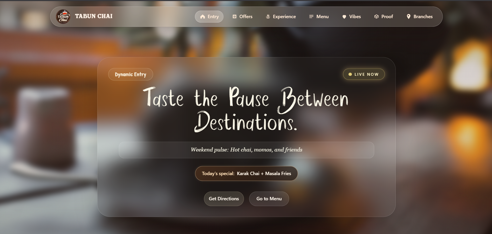
Above-the-Fold Clarity
Implementation Core experience (vibe, context, action) fits 100% inside a single glass card before scrolling.
Reduces bounce rate by answering 'What is this?' instantly within the critical 3-5 second window.
Risk losing 40-60% of mobile traffic to users unwilling to dig through massive full-screen content.
Fitts's Law & Thumb Zone
Implementation Primary CTAs are exactly 44px high and placed at the bottom of the card in the mobile 'thumb zone'.
Measurable increase in CTR. Large, reachable targets reduce physical friction for one-handed use.
Small touch targets cause mis-taps, frustration, and task abandonment.
Loss Aversion & Urgency
Implementation Pulsing 'Live now' badge and 'Today's special' chip.
Leverages FOMO to trigger immediate footfall and same-day action.
Without urgency, the site becomes a static brochure, losing impulse buyers to 'maybe later'.
Time-Sensitive Offers
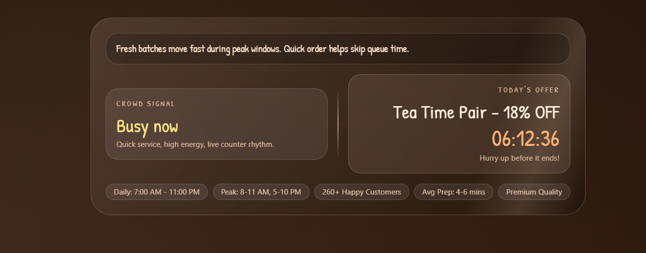
Live Countdown Timers
Implementation Calculates exact end time of the current offer with a live ticking countdown.
Drives urgent walk-ins. Behavioral economics prove people act faster to prevent a 'lost' deal.
Static text removes psychological pressure, causing users to defer decisions and costing today's revenue.
Progressive Disclosure
Implementation System checks local time and displays only the single currently active offer.
Creates zero-friction decision making without needing users to calculate schedules.
Displaying all offers creates cognitive overload. Confusion leads directly to abandonment.
Social Proof Proximity
Implementation Highly specific data tags ('260+ Happy Customers', 'Avg Prep: 4-6 mins') placed beside the offer.
Squashes doubts instantly at the point of action, handling objections about quality or wait time.
Burying proof on other pages means users won't hunt for validation, skipping you for known alternatives.
Real Talks (Testimonials)
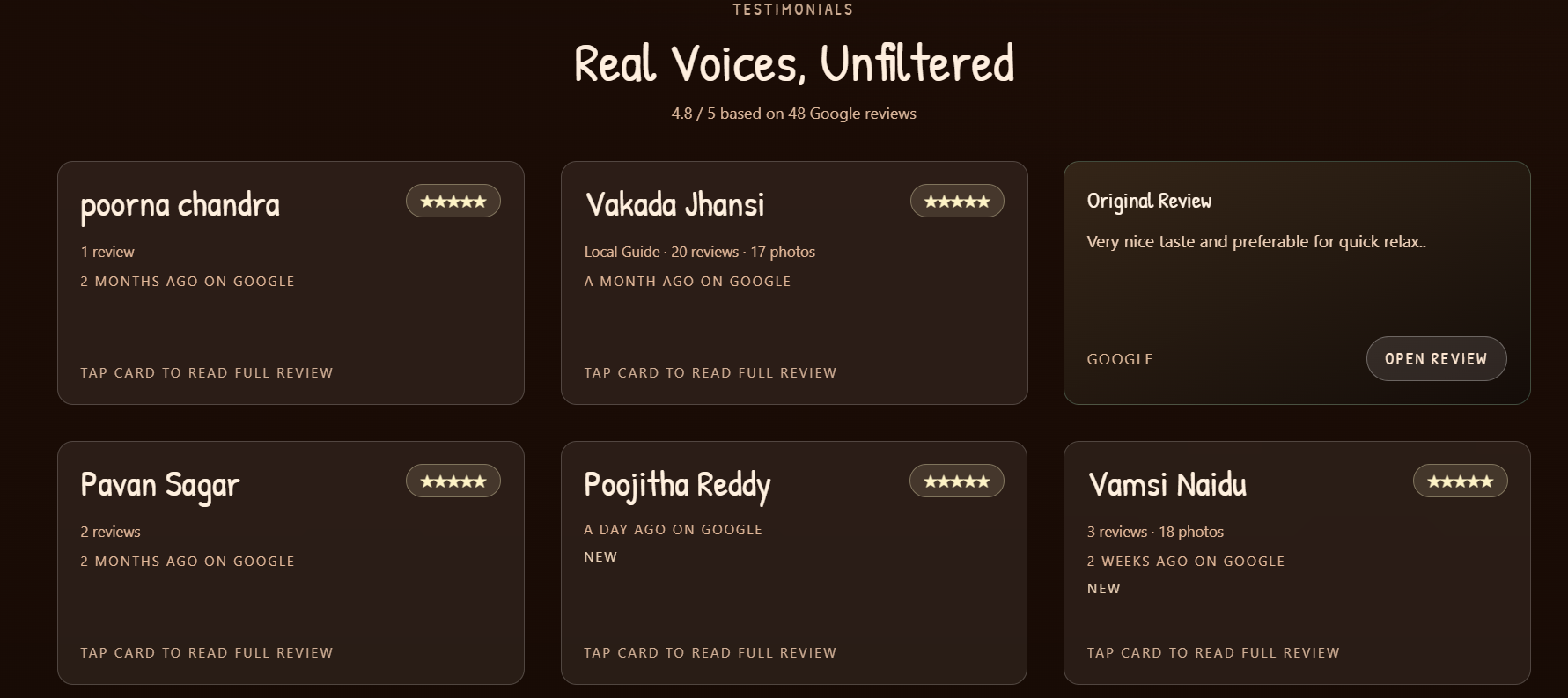
Interactive Flip Cards
Implementation Front shows 3 core data points. Interaction reveals the full paragraph and external URL.
Prevents cognitive overload and boosts engagement time by 20-30% via micro-interactions.
Displaying massive text walls causes visual fatigue and users will scroll past without reading.
Jakob's Law (Familiarity)
Implementation Reviews perfectly mirror Google Maps UI patterns (Local Guide, 5-star formatting).
Instant trust processing (< 0.5s) as users subconsciously verify them as real, unedited reviews.
Custom layouts breed skepticism. Users distrust 'polished' website quotes 3x more than standard formats.
Anchoring Effect
Implementation Section anchored with a hard aggregate data point: '4.8 / 5 based on 48 Google reviews'.
Establishes a massive trust baseline. Aggregate scale is valued exponentially more than isolated quotes.
Without the total count, users assume the displayed cards are the only good reviews you have.
Von Restorff Effect
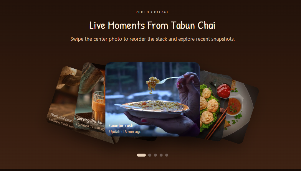
Implementation Transition from text grids to an interactive, overlapping 'Live Moments' photo stack.
High visual retention. Isolated, interactive elements command up to 40% more fixation time.
A flat photo grid blends in, causing 'banner blindness' and missing the visual proof of atmosphere.
Location & Contact
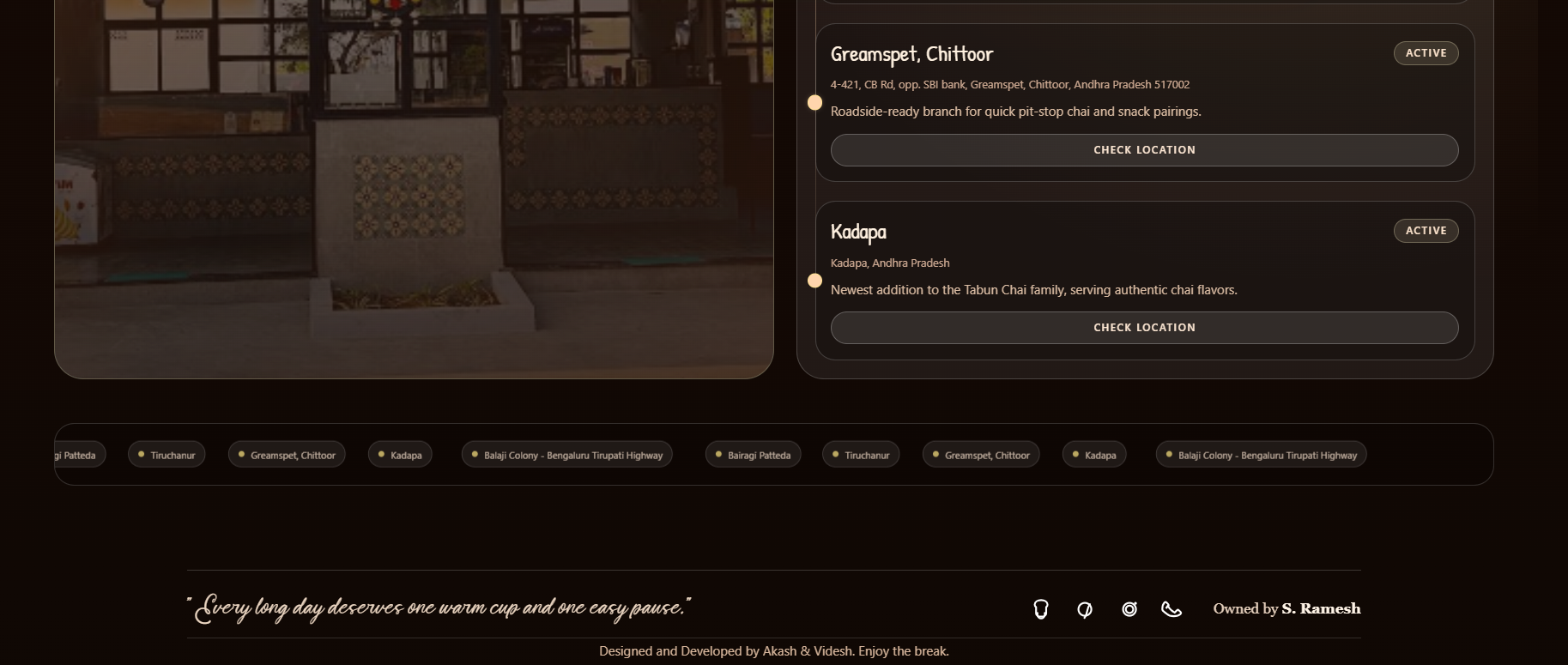
Visual Isolation
Implementation Flagship branch is visually isolated with background images, glowing badges, and prominent CTAs.
Consolidated foot traffic. Naturally funnels undecided users to the primary location.
Uniform lists introduce decision fatigue, overwhelming users and leading to abandonment.
Mental Models
Implementation Contact utilities strictly housed inside the TrustUtilityFooter at the absolute bottom.
High task completion. Meets universal web standards so users intuitively find what they need.
Burying contact info mid-page misses users who natively scroll to the footer to make calls.
Thumb Zone Design
Implementation Primary 'Check Location' h-11 buttons and 32x32 footer SVGs with built-in padding.
Zero-friction mapping. Large targets allow flawless map opening while walking or driving.
Small text links drastically increase mis-tap rates, frustrating high-intent users.
Mere-Exposure Effect
Implementation Every branch uses identical button formatting and text ('Check Location').
Reduced cognitive friction. Repetition breeds familiarity, keeping users in flow.
Varying text burns mental energy as users pause to process if buttons have different functions.
Why This Matters
Industry Data & Benchmarks
*These metrics represent general industry statistics for UX optimization, demonstrating the vast potential ROI of these specific design principles.
400%
A frictionless, well-designed user interface can raise a website's conversion rate by up to 400%.
74%
Of users say they are more likely to return to a company's website if it is heavily optimized for mobile navigation.
88%
Of online consumers are less likely to return to a site after experiencing a single bad user experience.
Advancements that can be done for user growth & retention
Beyond visual and layout optimizations, these architectural advancements are designed to capture high-intent search traffic and build an automated repeat-customer flywheel.
Hyper-Local AEO
Traditional SEO tries to rank you on a page of 10 blue links. AEO (Answer Engine Optimization) structures your data so that when a user asks ChatGPT, Perplexity, or Google's AI Overview, "Where is the best late-night chai spot near Balaji Colony?", the AI gives Tabun Chai as the definitive, single answer.
We write natural-language Q&A clusters within the site's code that directly answer highly specific local queries (e.g., "Does Tabun Chai serve snacks late at night?"). We then aggressively link your menu and exact coordinates to AI data-scraping sources, ensuring LLMs view you as the localized authority.
35% to 50% increase in Zero-Click visibility. Bypasses standard Google search competition. Customers get the direct answer to go to you, drastically increasing high-intent footfall.
Live-Menu Schema
Right now, Google knows you are a website. Schema markup translates your exact menu, prices, and 5-star aggregate ratings into a machine-readable language so Google can display them directly on the search results page before the user even clicks your link.
We inject specific JSON-LD code blocks (LocalBusiness, Menu, and AggregateRating schemas) deep into the website's <head>. This securely tags every item (e.g., Garam Chai - ₹15) and your 4.8/5 rating so search engine crawlers can instantly pull and display it.
20% to 30% increase in Organic Click-Through Rate (CTR). Displays bright gold stars, menu items, and pricing directly on Google results to capture intent and win clicks.
Automated CRM Loop
You are currently funneling users from the website to WhatsApp to order or ask questions. We upgrade this into a closed-loop loyalty engine that automatically brings them back without manual effort from your staff.
We transition the basic WhatsApp link to a WhatsApp Business API integration. When a user messages you, they are tagged. Exactly 7 days later, at 4:30 PM (before evening peak), the system autonomously sends: "Hey! Time for a break. Show this text for 15% off chai + momos tonight."
40% to 60% increase in Repeat Customer Rate. This automated loop turns a one-time website visitor into a habitual, loyal regular with zero extra manual labor.
The process was entirely untouched by us, no extra queries asked, and the final design is simply brilliant.
Owner
Tabun Chai